









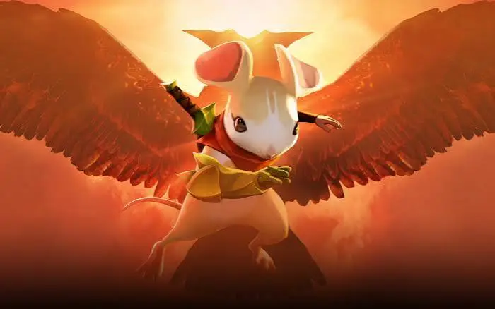
Strong Silhouettes
I chose this animation right around the time the studio behind Moss announced its closure…
It’s a brutal reminder that games, tools, and studios evolve, but certain animations continue to teach long after their creation.
This is the exact shot by Laura Lico I found myself thinking about.
It had been stuck in my head for a long time, as it is truly memorable. In review, it’s the kind of absolute reference you pull out to remind people what a strong silhouette looks like in action. The more you break it down, the more you see a concentration of animation decisions of striking clarity: weight, characterization, timing, overlaps… and above all else, a silhouette that remains perfectly readable under conditions that should have made it a mess.
On paper, this shot checks every box for things that destroy a silhouette:
- A tiny character
- A disproportionately massive weapon
- Fast-paced action
- Constant changes in footing
- Heavy inertia
Normally, the accumulation of these factors clutters the read and makes the character unreadable. Here, it’s the exact opposite: the eye never gets lost.
This is precisely the kind of reference shot you need to dissect to understand what a strong silhouette in action truly means.
The Intent Behind This Shot
Visually, the scene sets up a simple premise: a mouse launched into a combat combo wielding a hammer twice her size.
But what makes this animation compelling isn’t just the attack itself. It’s the relationship between the character and her weapon. The hammer is heavy, its stone head concentrating all the mass, but the mouse never submits to it. Every shift in footing, every bounce, and every change in grip turns a potential imbalance into a new burst of momentum.
To understand what makes this shot work, let’s break down three key aspects:
What we can learn from the challenges in this shot
1. The Two-Handed Weapon Trap
Two-handed weapons are a classic trap in animation. As soon as both hands are locked onto the same object, it becomes easy to create messy poses: arms merge with the body, the weapon masks the character, and lines of action dissolve. The real complexity lies in managing hands and grips. Lifting a heavy tool with your hands glued to the end of the shaft makes the effort look impossible and the action instantly rigid. For the scene to work, you have to think about shifting grips: distributing the hands to absorb the weight, then sliding them toward the end to maximize reach and deliver punchy impacts. It’s this hand movement that breathes life and narrative complexity into the animation.
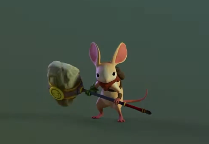
Laura’s feat of engineering in this shot is that the hammer never overshadows the mouse : it enhances her read.
We’re dealing with a formidable challenge: handling two entities with opposing dynamics (a tiny, agile mouse and a massive block of stone) while both hands are fixed to the same handle. Yet, nothing telescopes. The animation pulls off the feat of making both elements readable independently while combining them into a single unique silhouette.
On one hand, you understand the character’s agility and footing; on the other, you read the weapon’s inertia and force. The weapon’s design (a long, thin shaft coupled with a massive head) plays a crucial role by creating permanent negative space that detaches the mass from the body, even during the most airborne movements.
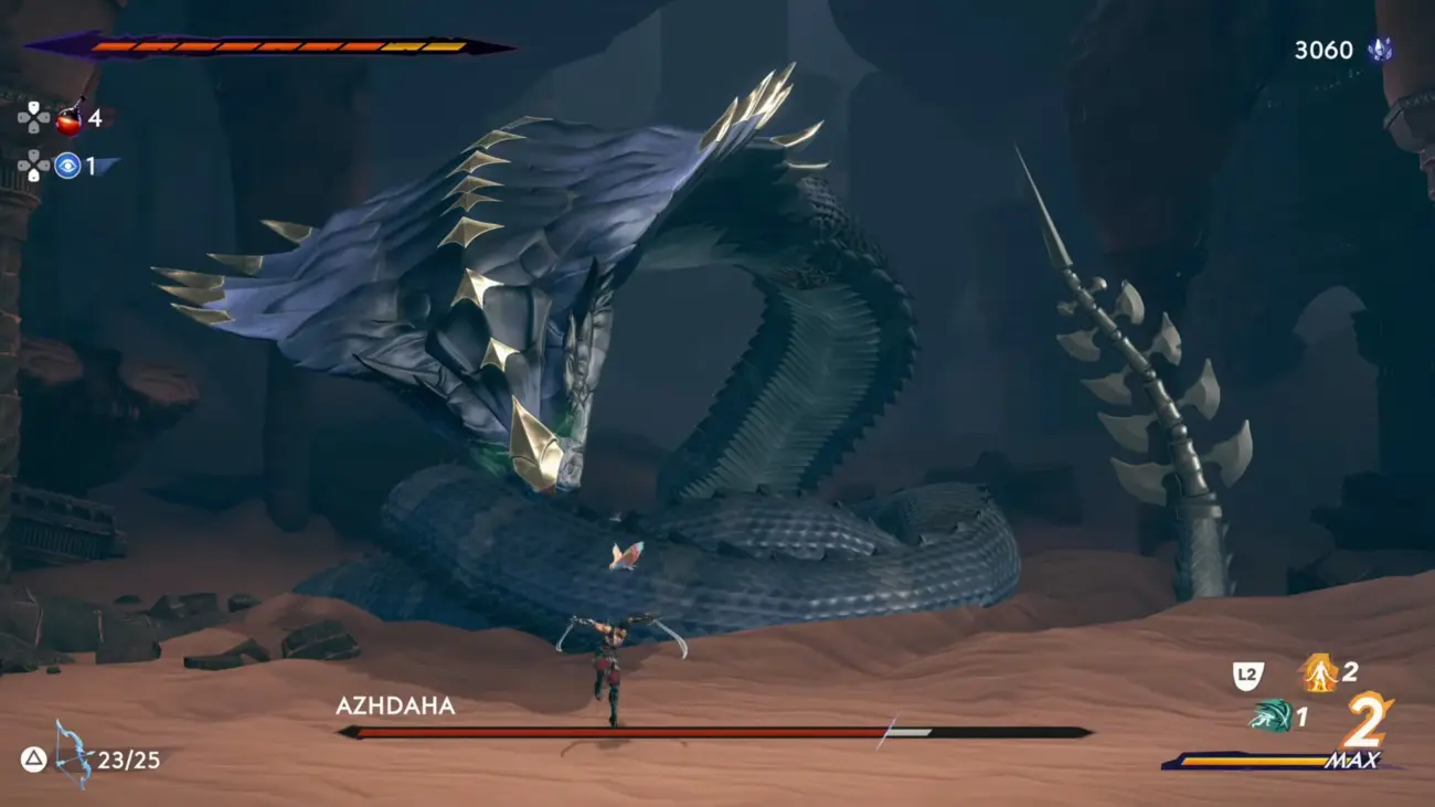
This is a problem I ran into frequently while working on the enemies in Prince of Persia. With smaller weapons, we had to get creative to detach them from the body so they remained identifiable. In 2D with a constrained angle, we looked for depth to prevent all elements from sitting on the same reading plane. With giant weapons, it was the exact opposite: the brute carrying his column took up so much space that the body’s silhouette got wiped out. Every single time, the same rule applies: if the character and the weapon merge into one, everything falls apart.
The golden rule to remember is that when an object is in a character’s hands, it stops being part of the backdrop, it becomes an integral component of the silhouette. You have to stop thinking of the character on one side and the weapon on the other, and instead conceive them as a single, inseparable visual block.
2. Showing Weight Without Sacrificing Characterization
Bringing life to a character handling a massive object while staying ultra-dynamic is a delicate balancing act. You easily hit a wall: either the weapon feels heavy but the character instantly turns stiff and frozen, or the character moves great but looks like they’re carrying a feather. To find the sweet spot, you have to understand that a living body never passively submits to its load; it constantly negotiates with it, using imbalances or tiny hops so that the object’s force becomes the engine of the movement.
Playing on the opposition between an oversized hammer and a tiny character runs the constant risk of one overshadowing the other.
On one side, the mass crushes everything; on the other, the character loses all physical credibility.
Facing a heavy weapon, the classic temptation is to slow everything down, letting the mass “crush” the character to make it look believable.
But that choice comes with a direct cost: the character’s personality and agility evaporate.
Laura goes the opposite route. She doesn’t choose between the weapon’s weight and the mouse’s agility. She makes them coexist.
In this shot, the hammer is heavy, the mouse is light, and yet at no point do they cancel each other out.
When the hammer hits the ground, the mouse bounces. When she accelerates it, she engages her entire body in the effort without losing her snap.
Both pieces of information coexist permanently in the silhouette: the mass pulls downward, while the body pivots or takes flight.
This contrast isn’t just a characterization choice; it’s a readability choice. By maintaining two opposing dynamics within the same silhouette, Laura lets the viewer read both pieces of information at once: the weapon’s mass, and the identity of the character wielding it.
That is where the real power of the animation lies: the hammer’s weight never drags her down. Instead, it acts as a catalyst, turning every physical constraint into a way to highlight her lightness and movement intelligence. The animation finds its identity precisely in this opposition.
Characterization doesn’t oppose silhouette. Good animation shouldn’t just be geometrically readable; it needs to precisely tell who the character is and how they interact with their world.
3. Ensuring Readability at Real-Time Speed
Polishing your key poses during the blocking phase isn’t enough to make an animation readable. For a silhouette to function at real-time speed, the core relies on the choice of pauses, rhythm variations, and alternating between clean accelerations and holding strategic poses.
All the technical difficulty lies in controlling where the viewer’s gaze goes right in the thick of the action.
A combat choreography naturally stacks up layers of complexity. If the rhythmic structure is rough, the viewer’s brain doesn’t have time to decode the information, and the eye tunes out instantly.
Maintaining attention requires pacing the impacts, holding key poses, and varying secondary animations to guide the eye.
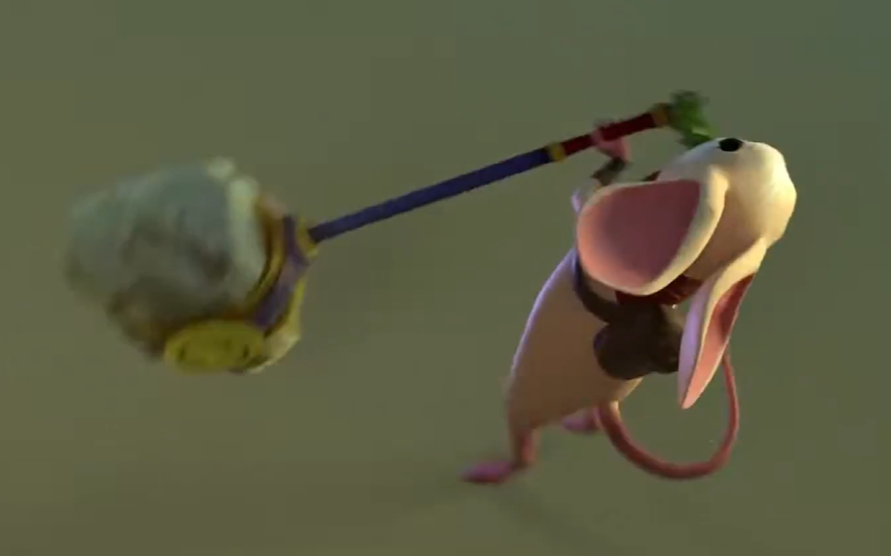
This shot by Laura features brutal accelerations, constant direction changes, and moments where the action compresses into just a few frames. And yet, you instantly understand where the weight is, where the effort is situated, and which way the energy is flowing.
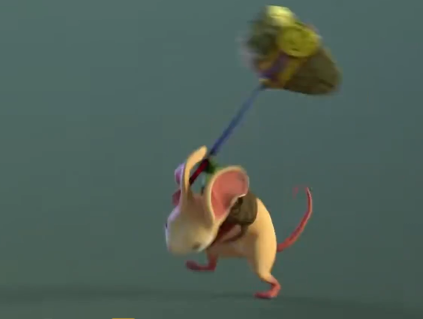
In this image, for instance: the mouse has already finished her movement and is initiating her transition while the hammer is still hanging in mid-air. This delay of the weapon showcases the full force of the incoming blow and the true weight of the mass, all while maintaining an absolutely crystal-clear silhouette.
It’s a masterclass in body mechanics and physics, where this lag directly serves readability.
This tour de force rests above all on the solidity of the key poses, where each one tells a precise story in silhouette. Anticipation announces the direction and nature of the attack, impact maximizes clarity by cleanly separating the weapon and the character, and recovery shows the cost of the action by letting the mouse absorb the inertia.
Layered on top of that is the highly functional role of overlaps. The ears, tail, and various offsets prolong the directions of movement and reinforce the read of each phase.
Finally, timing contrast, alternating compression moments with sharp accelerations, allows the movement to breathe.
This is the exact same type of challenge we had to solve on Prince of Persia, particularly for Sargon’s animations. On that kind of hero, the slightest latency directly disrupts the gamefeel: every animation had to be readable as early as possible so the player could chain actions without losing the thread.
It’s all a matter of dosage: how far can you compress anticipation without losing the read? How far can the blend absorb the start of an animation without the viewer losing the intent?
There is no magic formula, just testing, over and over, to find the exact sweet spot where responsiveness and readability coexist.
The silhouette is always the primary indicator: it’s what validates whether the intent survives the motion.
In animation, the ultimate test of the silhouette is real-time speed. If the intent gets lost in the motion, then the hierarchy of shapes and timing must be rethought.
Try it yourself
Reproducing a shot like this isn’t necessarily an advanced polish exercise: it’s primarily an exercise in readability. These are the steps to validate an attack blocking before heading into splines. If the shot doesn’t hold up on these fundamentals during a review, we rework the core before adding details.
Take a character and give them a disproportionate weapon: a hammer, an axe, a spear too big for them.
Laura Lico’s showcase features several attacks, but for this exercise, I recommend focusing on just one. A character, an imposing weapon, no background, no visual effects, no combos. This simplification is intentional: when working on the silhouette, every choice must remain visible and immediately analyzable. The question is no longer whether the animation looks pretty. The question becomes: is the intent of the attack clear?
1. Three Poses Must Be Enough
This is probably the most important lesson when working on silhouettes. If you strip away all overlaps, all breakdowns, and all secondary details, the animation must still function with just three key images: anticipation, impact, and recovery. If these three silhouettes clearly tell the story of the attack’s intent, then details can enrich the movement. If not, no amount of polish will ever truly save the animation.
Silhouette goes beyond shape; it directly translates intent. A good silhouette lets you understand what the character is going to do. An excellent silhouette lets you understand why they are doing it and how they are going to do it in a minimum number of poses.
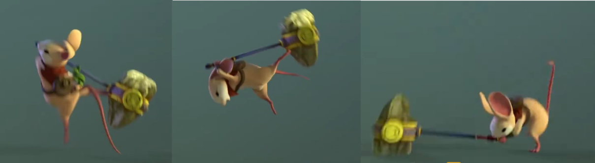
2. Weight Must Not Be a Cliché
Weight isn’t born from theatrical over-effort, but from physical constraint and center-of-gravity management. Since the body naturally seeks the path of least resistance, it must constantly compensate to avoid getting dragged away by an off-center mass.
Observe reality: facing a heavy load, the stance widens, the center of gravity lowers, and the torso leans to counterbalance. Hand placement is crucial for mastering levers and absorbing effort. Instead of cranking up amplitude, ask yourself how the skeleton fights its own imbalance: it’s this calculated resistance that sells heaviness.

3. Anticipation Must Tell a Story
The most common mistake is seeing anticipation as a simple mechanical reflex in the opposite direction of the action. The character swings right, so they wind up left. Technically, the movement works. But narratively and physically, it tells nothing.
In reality, anticipation serves first to place the body in the zone of greatest muscular power to unleash an ultra-explosive impulse. A good anticipation therefore serves to prepare the body to deploy energy, but also to inform the viewer of what’s coming next: is it a fast strike, a heavy attack, a zone sweep, or a ground slam? The initial silhouette must be a clear message.
4. Impact Propagates Through the Body
An attack’s impact is the exact moment where all accumulated energy finally finds a target to discharge into.
We often try to rush past this fraction of a second, operating on the intuition that the faster the movement whips by, the more speed and energy it gains.
It’s the exact opposite: to deliver visual force and weight, animation benefits from locking down the beat across several strong, committed frames.
That is the power of a momentary freeze combined with a suspension phase: by stopping the movement dead or holding the attack’s signature pose for an instant, you create immediate readability that registers the violence of the shock while retaining the momentum needed to chain into the rest.
This is the exact moment the kinetic chain reverses: the weapon stops, but the body continues to absorb the inertia or ripple it through its segments.
If everything stops at once, the attack goes limp; if the energy keeps traveling, the shock becomes organic and gives the flawless illusion of an unstoppable mass hitting real resistance.
5. Recovery Proves the Attack Existed
Anticipation announces the intent, impact delivers the action, and recovery proves that action had a cost.
This is the stage that single-handedly sells a massive portion of the animation’s weight.
The way a character recovers, absorbs remaining energy, and rebalances tells you just as much about their strength as the attack itself.
An inhabited recovery exposes the body’s imbalance, the latency needed to absorb the load, and the organic struggle to find stable footing or prep the next action.
A neutral, instant snap back to the initial pose completely kills the physical credibility of the movement; conversely, a body that takes the time to mark its vulnerability gives its effort undeniable reality.
Conclusion
We’ve covered the fundamentals with the Skill Booster on silhouettes, followed by how to leverage those basics on Woody’s rig. Laura’s shot fits right into the continuation of our analysis to reinforce key takeaways:
The silhouette is the absolute framework of intent. It is what lays down the foundations of an animation. By stripping the animation down to 3 poses that are enough to tell the story of a body fighting its own weight, details can finally play their true role: giving life to the action.
Forget the polish as long as the silhouette tells nothing. The rest is just window dressing.
Related posts
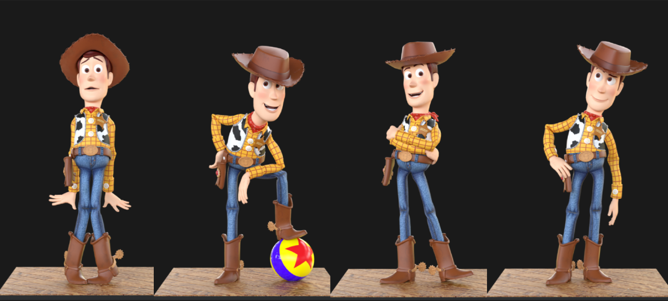
What You Can Learn From… Woody ! Reading Silhouette Like a Pro
Five poses from Toy Story, broken down shot by shot, and how to rebuild each one on the free Woody rig for Maya.
Art of the Hold
Keeping Stillness AliveThere's a moment in animation that trips up a lot of people, and it's not a complex breakdance or a tricky overl...
SKILL BOOSTER: Mastering your silhouette
Silhouette is the first language of animation. A pro game animator breaks down line of action, weight, negative space and the workflow behind poses that read instantly.
Animating, exploring, starting over for twenty years
After twenty years in an animation career, Vanessa Rufra reflects on passion, burnout, starting over, and what truly keeps you moving forward in this industry.
Timing & Spacing
Timing and Spacing in Animation: Why Spacing Is So Important
Every animation textbook pairs them together. Spacing and timing....
Procedural Animation
There's a moment every game animator knows. You've just finished a beautiful walk cycle. The foot plants are perfect, the weight reads ...

1st-Person vs 3rd-Person Animation
When people starting out in game animation ask which style they should focus on first, most seem to assume it doesn't really matter. An...
The 12 Principles of Animation, Reframed for Games
Frank Thomas and Ollie Johnston, circa 1995.Image courtesy IMDB.
Almost every animator who comes up through formal training gets the ...
Meet the Speakers: How to Break Into the Animation Industry

For anybody out there that is trying to break into the animation industry right now, this one is for you. This Thursday, May 21 at 10 A...

AI in Game Animation Won’t Replace Animators – But Ignoring It Will
AI is changing game animation. It won't replace skilled animators, but the ones who ignore these tools are taking an unnecessary career risk. Here's an honest breakdown of what's actually happening.

How to Build a Game Animation Showreel That Actually Gets You Hired
Most game animation showreels fail not because of weak animation, but because they're poorly structured, too long, or unfocused. Here's how to build a reel that hiring managers actually want to watch.

How to Future-Proof Your Game Animation Career: The Skills Studios Are Hiring For in 2026
The games industry is shifting fast. Here are the skills that studios are actually hiring for in 2026, and how game animators can build a career that stays relevant through the change.