












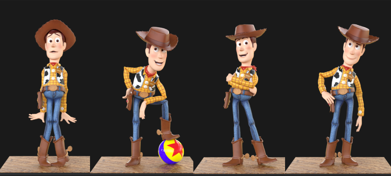
Woody is thirty years old. And he still shows silhouette with a clarity few characters ever reach.
Pixar’s animators spent years tackling a problem every animator faces: how to make a silhouette readable, expressive, and immediate.
Woody is an iconic character, but more importantly, he’s an excellent teacher.
He carries decades of refined artistic decisions across five cult films: open masses, clear shapes, and an intention you can read before he even moves.
Nothing is accidental, and that’s precisely what makes him an ideal model for understanding what makes a pose truly readable.
This article is an invitation to look at this character differently: a guided exploration to train your eye to read silhouette like a pro, through five precise poses from Toy Story, and to apply these lessons directly on the free Animworks Woody rig.
Why Woody is a Good Teacher
A stylized rig reveals what a realistic rig hides.
Many beginner animators want to jump straight into animating realistic characters. It makes sense: it’s impressive, it’s prestigious, it looks like the “final goal.” But realism is a trap.
With the uncanny valley, the slightest inconsistency in body mechanics jumps out immediately: our brains are constantly trained to observe humans moving, and they detect anything unnatural in a split second. Working your poses on a realistic rig makes everything harder: every mistake becomes a complex problem, difficult to isolate, difficult to fix.
Stylized characters, on the other hand, can exaggerate without breaking. A stylized rig lets you open the masses, push the angles, amplify the diagonals, explore poses that would be impossible on a realistic character. And it’s precisely that exaggeration that reveals the fundamentals:
where the pose breaks, where the intention disappears, where the silhouette closes, where the direction stops existing.
Woody exposes all of this in a matter of seconds. He shows what realism hides. He makes visible what’s essential to improve.
That’s why he’s such a good teacher: he lets you learn the foundations of silhouette in a space where mistakes are readable and exploration is possible. He highlights the decisions every animator needs to learn how to see.
What Woody Is / Isn’t
Woody is a stylized character designed to make silhouette impossible to ignore. His cartoon proportions, simple volumes, and exaggerated acting amplify the essential decisions of a pose: direction, tension, negative space, diagonals, shapes.
With him, anything that feels vague elsewhere becomes obvious.
And sometimes, Pixar pushes exaggeration far enough to break human anatomy on purpose: in his run, Woody moves forward with the same-side arm and leg, with joints that “bend” in ways no real body could. It’s masterful, because it serves his personality, and above all because it keeps the silhouette readable from any distance. You could never make that choice on a realistic rig, but it’s perfect for understanding how a pose communicates, independent of biomechanics.
Woody isn’t a rig built for realistic locomotion or anatomical performance. And that’s exactly what makes him valuable: by removing the complexity of the human body, he exposes the structure of a pose, what opens, what closes, what guides the eye, what carries the intention.
In short, Woody is a clarity tool. He doesn’t show how a body works, he shows how a silhouette works. And that’s exactly what you need to progress.
In animation, people often say a pose has to “work.” But what does work actually mean?
It means survive. Survive distance, survive a flip, survive rotation, survive blending, survive the fastest acting. A pose isn’t judged by what it is, it’s judged by what it endures.
That’s exactly what Woody teaches you. Not the beauty of a pose. Its resilience.
5 Lessons from Woody
When Toy Story was released in 1995, animating humans was a challenge: the uncanny valley was huge, the tech was still limited, and the slightest “unnatural” movement stood out immediately. Pixar made a brilliant choice: tell a story with toys. A world where exaggeration, broken poses, and animation liberties become strengths, not flaws.
Woody was born from that constraint, and that’s what makes him so interesting. If Pixar chose him as the hero of the first full-length 3D animated feature in history, it’s because his design is solid. And the fact that he still works thirty years later proves that his principles have been tested, refined, and validated film after film.
The five lessons that follow aren’t theories: they’re principles visible in specific poses from Toy Story, and you can apply them directly on the Animworks Woody rig. Each lesson ends with a concrete practice section, a way to immediately transpose what Pixar did onto the rig.
Lesson 1: Exageration, Making the Intention Impossible to Miss
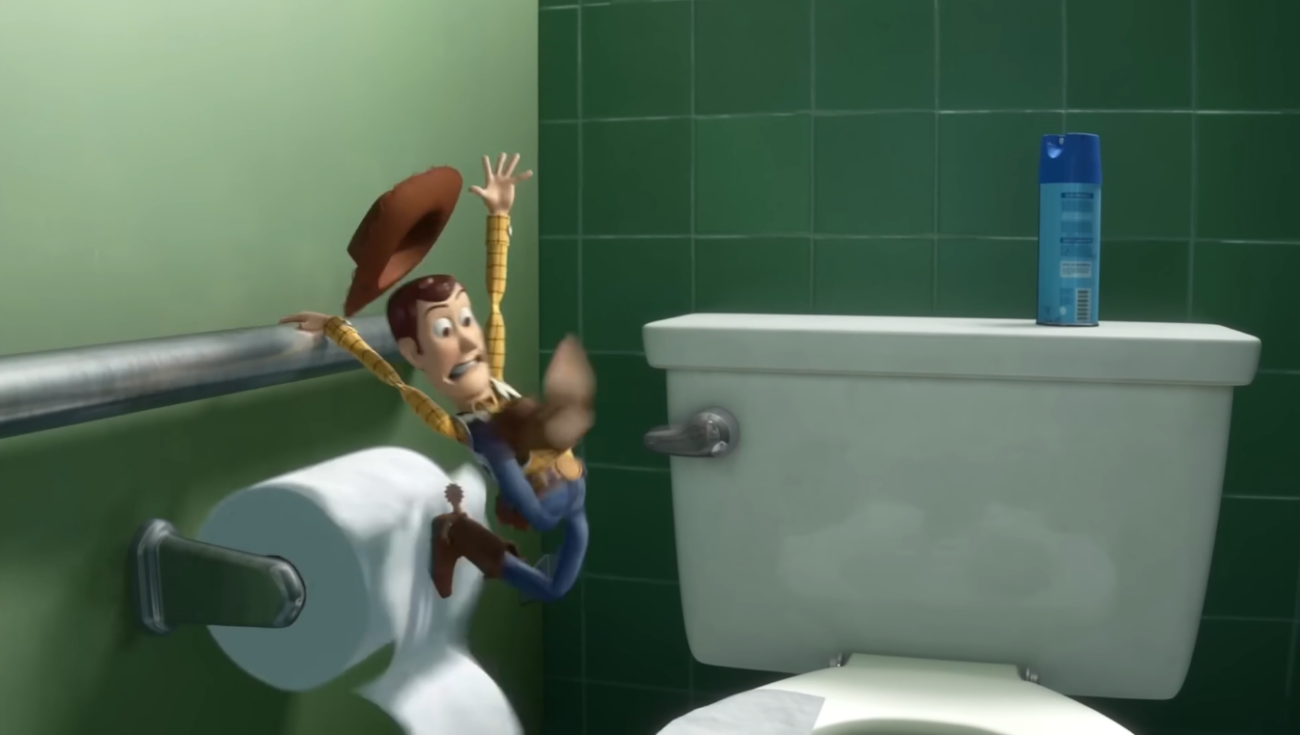
Exaggeration is a powerful readability tool. This pose works because it pushes every element just far enough to become impossible to miss, without ever tipping into “broken” anatomy. It’s intelligent exaggeration, the kind that amplifies intention while staying credible.
What Pixar does
They push the angles right to the edge:
- The legs form an improbable angle, too wide to be realistic, but perfect for conveying loss of balance. A human couldn’t hold this pose, but the intention is crystal clear.
- The arms are stretched to their limit, each in a different direction. This deliberate asymmetry creates instant tension: Woody is trying to catch himself and panicking at the same time.
- The backward arch of the spine is pushed just enough, reinforcing the body’s main diagonal, while the pelvis points forward. Nothing is anatomically broken, but everything is engineered to strengthen the dynamic.
- The hat flying above his head adds an extra layer of energy: the movement is so abrupt that even the accessories can’t keep up.
The whole pose stays anatomically coherent, but right at the edge of what a body could do. That’s exactly where exaggeration becomes effective: just beyond realism, but never outside the language of the body.
What it teaches you
Exaggeration is a communication tool. A timid pose fades away, it disappears inside the movement. A pushed pose reads instantly.
A single pose can communicate an entire action, and this one proves it. You immediately understand that Woody is slipping, losing balance, and catching himself with his right hand, without needing motion, context, or an extra shot.
And that’s why exaggeration is the ideal starting point: it’s always easier to tone down a strong pose than to strengthen a weak one.
For years, I worked mainly with mocap. My job was to faithfully reproduce the actors’ performance and adapt it to gameplay constraints. Exaggeration wasn’t really part of the equation, the source data was already there.
It’s on Prince of Persia: The Lost Crown, in full keyframe, that I truly understood what exaggeration brings. Not as a style, as a tool. Since then, even when I’m refining mocap, I never look at a pose without asking myself whether the intention is strong enough. Woody taught me to see that before I ever practiced it.
Try it on the Animworks rig
Look for extreme angles rather than perfect anatomy. Open the masses, create asymmetry, push the diagonals. Stretch the spine, arms, and legs right up to the edge of credibility. Add details that amplify the energy, accessories, head, gaze.
Check the silhouette in full black: if the action reads in a single frame, you’re in the right place. If the pose feels “too much,” push it a little further. You’ll dial it back later.
Lesson 2: The Scene Must Read in a Single Glance
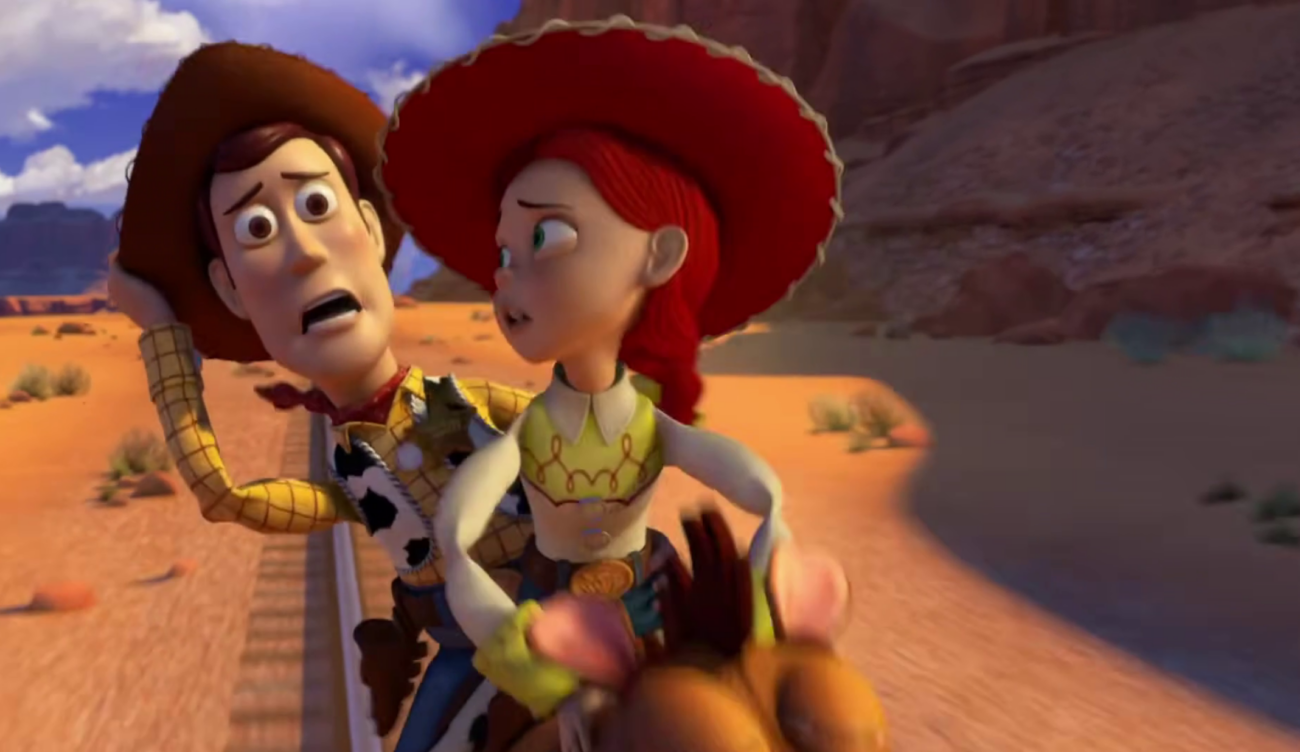
In this scene, Woody and Jessie are mid‑gallop, perched on a horse running at full speed. Pixar is handling two characters in motion, a horse, large hats, and a background rushing past. Despite all this complexity, the read is immediate: in one glance, you understand who’s doing what, who feels what, and where the energy of the scene sits. It’s the result of precise work on shapes and on the main line of action.
What Pixar does
They organize the scene around a clear line of action. Woody is placed on a diagonal; his body opens the space and creates a distinct visual zone around Jessie. Even with two characters packed tightly on a mount, their silhouettes never interfere with each other: Woody carries the tension, Jessie carries the emotion, and each occupies their own visual “territory.”
The hats, despite being large volumes, are oriented to support the overall direction rather than disrupt it. Anything that could clutter the read is simplified; anything that carries intention is emphasized.
What it teaches you
A silhouette must be understood instantly. If the viewer has to search for information, the pose fails. Readability isn’t a bonus, it’s the foundation of visual communication.
A good pose guides the eye, clarifies the action, and conveys emotion in a fraction of a second, even in a complex scene, even with multiple characters.
Before 3D animation, I studied visual communication. It was the first time I discovered a field where I wasn’t naturally good, where I had to search, observe, and understand differently. I hated advertising, I never did the kind of 3D we were promised, but I learned something that followed me throughout my career: information hierarchy, composition, immediate image readability.
I didn’t know it yet, but those principles would become the foundation of my work as an animator. Because animation is exactly that: organizing visual information so the intention is understood instantly, with an added layer of emotion, character, and observation.
Try it on the Animworks rig
Pick a simple action with two elements, an arm opening, a head turning. Clarify the dominant line of the pose, separate the masses, avoid overlaps. Then add a second element, an accessory, a different direction, and check that both coexist without interfering.
The goal: each element must occupy its own visual space. If you have to search for the intention, something is overlapping.
Lesson 3: Negative Space Tells the Action
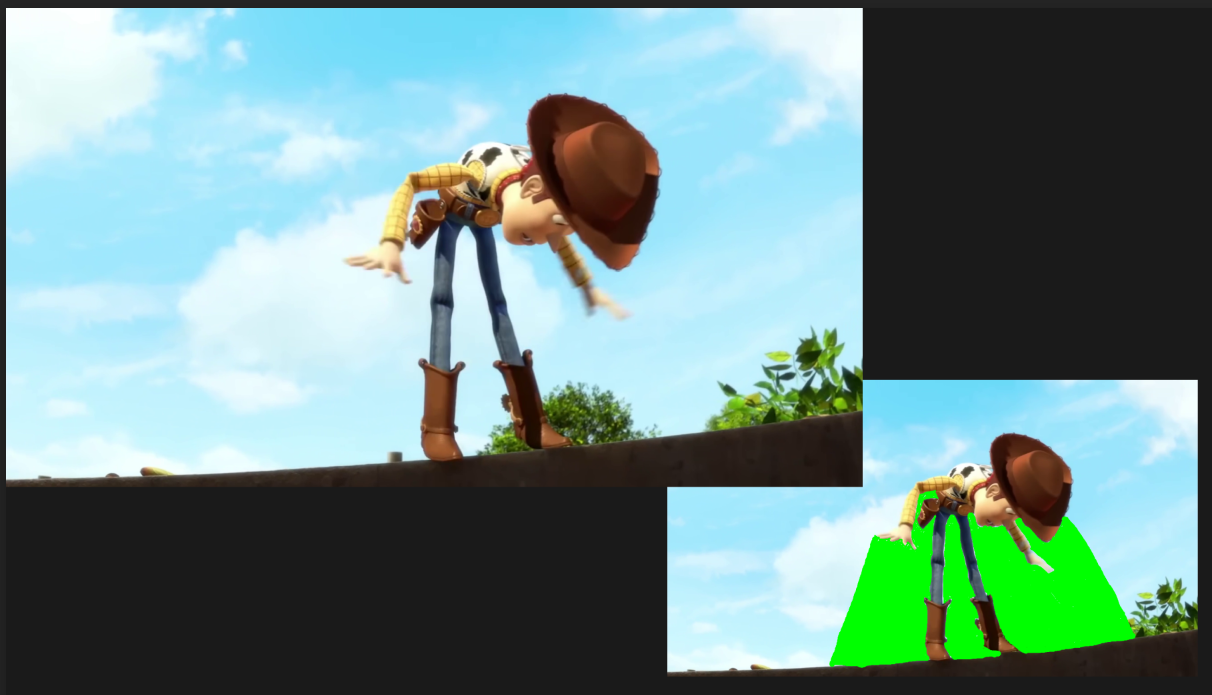
In this pose, Woody stops just before tipping into the void. He’s frozen in a moment of tension, suspended between the momentum of the run and the fall he narrowly avoids. And what tells that story isn’t just the pose, it’s the negative space.
What Pixar does
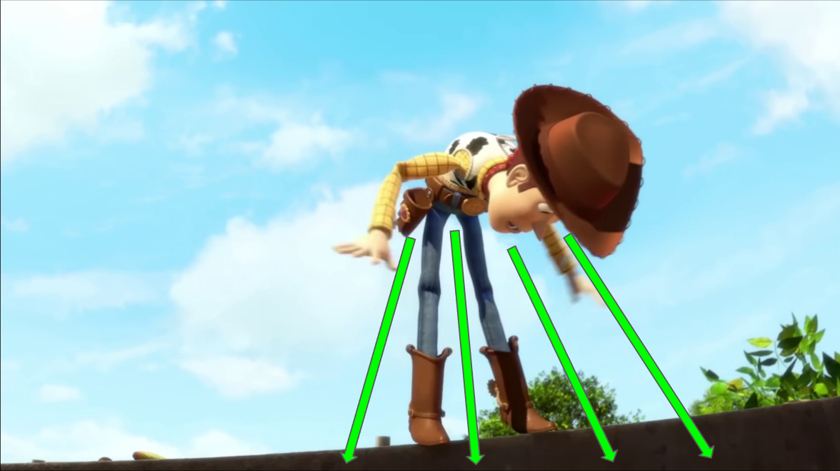
They sculpt empty spaces that tell the story before you even look at the details. They place all the negative space in front of Woody, oriented toward the drop. That choice creates the feeling of being pulled downward.
There are three major negative spaces, all built the same way: tight at the top, widening toward the bottom of the frame.
- Under his right arm, thrown forward, a narrow space opens like a cone toward the void. This downward shape guides the eye and reinforces the forward tilt.
- Between his legs, the same logic: tight at the top, wide at the bottom. Visually, his supports “spread apart,” which amplifies the loss of balance.
- His left arm opens a large empty zone pointing directly toward the cliff. It’s literally a visual arrow.
Even his head and hat tilt downward. They don’t create negative space, but they orient the read in the same direction: toward danger.
Finally, Pixar adds a brilliant detail: the void is represented by a thin black strip, in total contrast with the bright sky. This contrast dramatizes the potential fall and immediately pulls the eye downward.
Everything is designed so the eye drops. Everything is designed so the body tips.
What it teaches you
Negative space guides the eye and reinforces direction. It’s not “empty”, it’s a directional force. It can push, pull, open, close, destabilize.
In this pose, it tells the action better than any movement could: Woody isn’t just stopping, he’s about to fall.
A compact pose is neutral. A pose with oriented negative space becomes narrative.
On Prince of Persia, one of the hardest enemies to make readable was the Sand Warrior, a character who moves backward in time. Every pose had to be instantly understandable, because the player needed to anticipate actions that didn’t follow normal motion logic. The negative space around the weapon was crucial: if the weapon blended into the body, the player lost everything : attack direction, reaction timing, threat level. Constraints like this teach you that negative space isn’t an aesthetic choice. It’s a matter of information survival.
Try it on the Animworks rig
Build a pose of tension or imbalance, a character about to fall, launch forward, or step back. Before placing the arms, ask yourself: where do you want the eye to go?
Place the negative spaces in that direction. Open them where you want momentum, tighten them where you want tension.
Switch the pose to full black and check: do the empty spaces tell the action without needing any movement?
Lesson 4: The Line of Action Carries the Energy
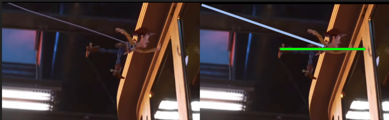
In this pose, Woody launches himself into the void, propelled by the rope. His entire body is oriented forward, stretched toward a single intention: reaching the window. And what makes that energy readable is the line of action.
What Pixar does
They build the pose around a dominant diagonal, from the foot to the arm. The line of action is long, fluid, continuous, running through Woody’s entire body without interruption. It starts at his left foot, stretched backward, rises through his leg, crosses his pelvis, torso, and shoulder, and extends all the way to his left hand, thrown forward.
This diagonal is dynamic: it carries the energy, creates the movement, and tells the direction. Everything in the pose reinforces it: the back leg opening the base, the torso following the exact same trajectory, the extended arm prolonging the line toward the window, the head, gaze, and hat all pointing in the same direction.
The rope doesn’t follow this diagonal, it comes from above, in a different direction, creating a sharp angle with the body. That angle acts like a visual arrow: it focuses attention, dramatizes the momentum, and strengthens the propulsion.
No mass breaks the curve. No detail distracts the eye. Everything is aligned to tell one thing: Woody is launching forward.
What it teaches you
A strong diagonal = a readable intention. It’s one of the most powerful tools in animation: it carries energy, guides the eye, and gives a clear direction.
In this image, Woody isn’t “moving”: he’s darting forward. He isn’t “reaching”: he’s aiming. He isn’t “hanging”: he’s being propelled.
The diagonal turns the line of action into intention. The line of action turns the pose into energy.
And a second line crossing it at a sharp angle amplifies that energy. It’s a fundamental rule of composition: converging lines create movement, tension, and direction.
Try it on the Animworks rig
Choose an action with momentum, a jump, an attack, a sprint. First find the dominant diagonal of the body: from the supporting foot to the farthest extremity. Align torso, pelvis, and arms along it without breaks. Then add a second line crossing it, an accessory, a weapon, a rope, at a clear angle.
Compare the pose with and without that second line. You’ll immediately see the difference in energy and direction.
Lesson 5: The Silhouette Must Survive the Acting
In this sequence, Woody is on the ground, the paraglider suddenly catches wind, and within a few frames he’s yanked upward and disappears off‑screen. It’s fast, violent, almost slapstick acting, and yet the silhouette stays readable from start to finish.
This is exactly what senior animators aim for: a silhouette that stays stable, coherent, and recognizable, even when the acting shifts brutally.
What Pixar does
They build a silhouette that barely deforms, even when the action becomes extreme.
Frame by frame:
Frames 1–2: Woody is on the ground, almost still. The silhouette is clear, compact, perfectly readable.
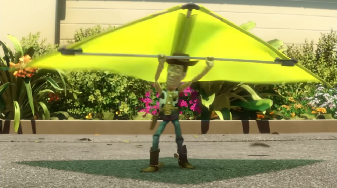
Frame 3: The paraglider pulls. The arms stretch upward, but the rest of the body stays rigidly stable. The silhouette changes on only one axis: the direction of the pull.
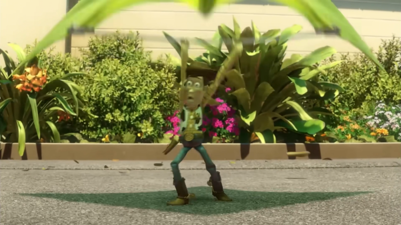
Frame 4: The pelvis begins to rise. The feet barely move. The silhouette stays anchored, allowing the viewer to follow the action without losing Woody.
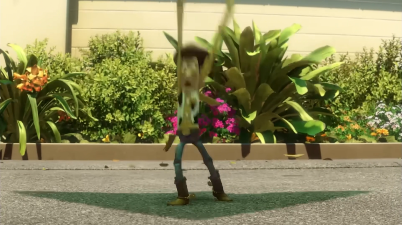
Frame 5: The legs and body stretch, but again: the feet remain almost in the same place, stabilizing the read.
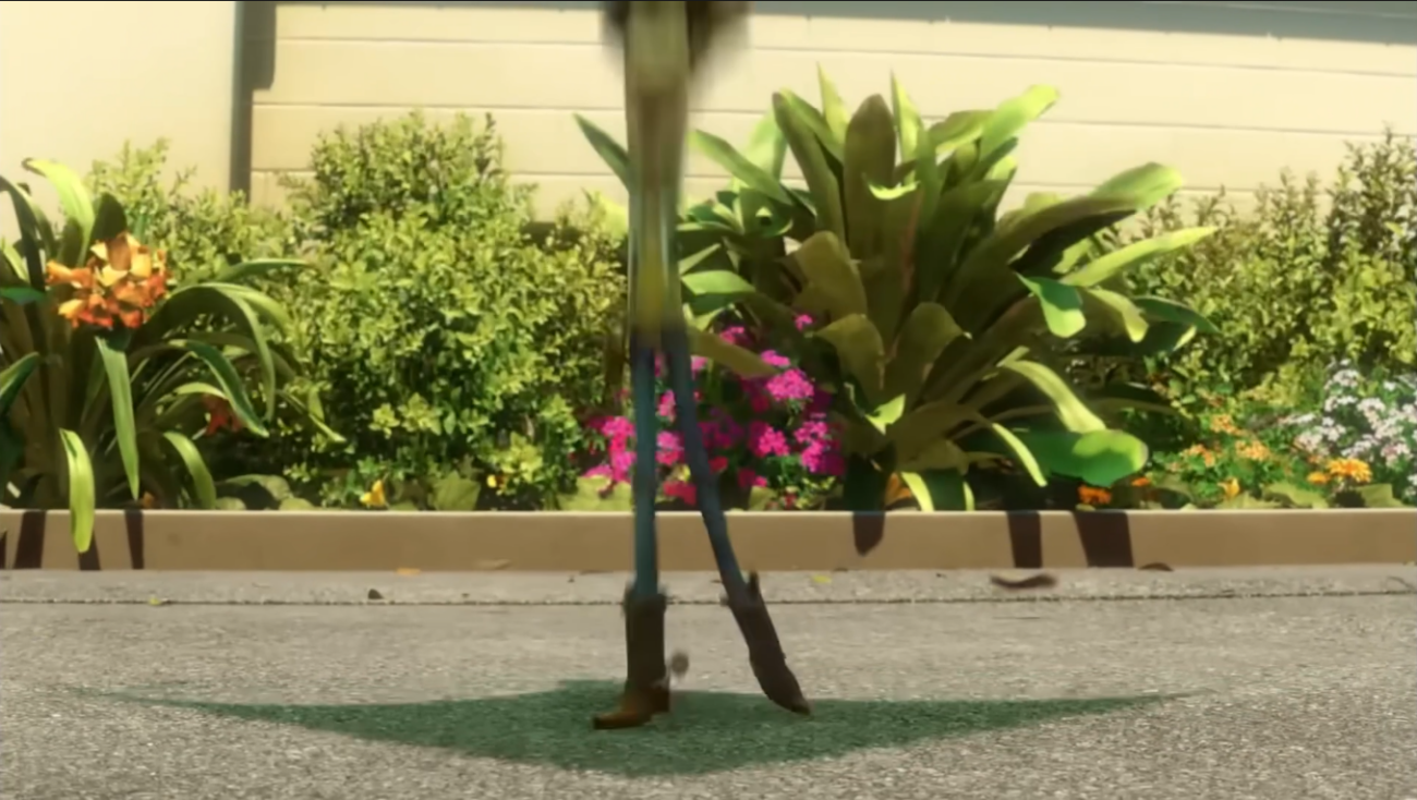
Frame 6: Woody is almost entirely off‑screen. Only the lower legs remain, stretched in a pose nearly identical to the previous frame, simply shifted upward.
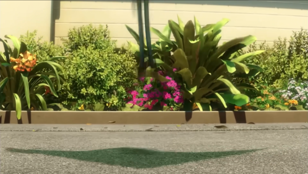
What’s remarkable: the silhouette doesn’t change shape, it only changes position. That’s what allows the viewer to follow Woody despite the speed.
What it teaches you
A readable silhouette isn’t just a strong pose, it’s a pose that survives movement.
In fast action:
- if the silhouette changes shape every frame, the viewer loses the character;
- if the silhouette stays coherent, the viewer follows the action effortlessly.
In video games, animations never play alone. They blend constantly, a run transitioning into an attack, an idle shifting into cover. That’s where silhouette becomes critical: if the key poses aren’t solid, the blend erases everything.
But the opposite is also true, and it’s something I learned on the job: the blend can cheat. If you think intelligently about the silhouettes at the start and end of an animation, if you avoid snapping back to the exact same poses at every transition, you get something dynamic, fluid, alive.
The silhouette doesn’t need to be perfect every frame. It needs to be coherent at the moments that matter.
Try it on the Animworks rig
Create an action in five frames max, a character jolting upward, being pulled, jumping. Start by building the starting pose and the ending pose. Check that both are readable in full black silhouette.
Then add the in‑between frames, changing only one element at a time, an arm, a direction, a tension. The main silhouette must stay recognizable from start to finish.
If you lose Woody along the way, too many elements changed at once.
How Pros Analyze a Pose
Analyzing a pose like a pro isn’t about “checking if it looks nice.” It’s about breaking down the internal mechanics of the pose: what carries the intention, what guides the eye, what tells the action.
And there’s a moment in learning animation when this way of looking shifts : when you stop watching a film as a simple spectator.
When I started studying staging and image analysis alongside 3D animation, I realized nothing was accidental: not in a film shot, not in an animation pose, not in the way a silhouette occupies space. From that point on, observing became second nature : people’s movements in the street, framing choices in a movie, character poses in a cartoon.
That way of looking, that ability to see, is what this article tries to pass on.
And Pixar has been one of my references from the very beginning: for the quality, for the creativity, for the precision behind every visual decision. Working with a reference like Woody is a real opportunity to study the best.
From there, we can move into the concrete: here’s the senior workflow for analyzing a pose.
Here’s the senior workflow for analyzing a pose of Woody, or any stylized character.
1. Look at the masses
Pros always start with the masses: torso, pelvis, arms, legs.
They check whether they’re open, readability, energy, direction, or closed, neutrality, confusion, loss of intention.
The masses are the structure of the pose: if they’re clear, everything else can be built on top.
2. Identify the main line of action
Pros immediately look for the line that carries the intention, the one that runs through the body, guides the eye, and communicates the energy.
Often it’s a diagonal, because diagonals are dynamic.
But whatever the shape, if the line is clear, the pose is clear. If it’s muddy, the pose is muddy too.
3. Read the negative space
Negative spaces are visual vectors.
Pros analyze whether the empty areas guide the eye or block it.
A well‑placed negative space opens the pose, creates direction, clarifies the action.
A poorly placed one closes the pose, compresses the masses, and makes the silhouette unreadable.
And most of the time, the issue isn’t just a “bad” negative space, it’s a missing one, or one that doesn’t carry any intention.
4. Flip the pose
Animators flip the pose in mirror.
If it stays readable, it’s solid. If it collapses, it relied on fragile balance or poorly thought‑out asymmetry.
Flipping reveals weaknesses the eye doesn’t catch immediately.
5. Simplify the pose mentally
Senior animators simplify the pose to its essential shapes.
If the silhouette stays clear when you reduce it to a few strong masses, the pose works.
If it only reads when every small detail is visible, it’s too complex.
Simplicity is a test of readability, not of style.
Why this workflow works
Because it doesn’t judge the pose on aesthetics, it judges it on its ability to communicate.
A pose is a message.
This workflow ensures the pose tells something, even before it’s animated.
Apply it to each of the five poses analyzed in this article. You’ll see exactly why they work, and how to reproduce the same logic on the Animworks rig.
Key Takeaways
Woody is a silhouette teacher. His poses show that readability is the foundation of any intention.
Exaggeration is a clarity tool. It amplifies direction, tension, and dynamics, without ever sacrificing coherence.
Shapes must read instantly. A pose that needs to be “interpreted” is already a failed pose.
Diagonals and negative space are vectors. They guide the eye, carry the energy, and tell the action before any movement exists.
The silhouette must survive the acting. If the pose stays readable in flip, rotation, or blend, it’s solid.
What you learn from Woody is universal. These principles work on any rig, any style, any project.
Conclusion
Woody isn’t just an iconic character, he’s a living demonstration of what makes a pose readable, expressive, and immediate.
The next time you watch an animated film, pause on a single pose.
Ask yourself: what were they trying to say with this silhouette? Which diagonal carries the intention? Where are the negative spaces, and where do they guide the eye? What makes this pose readable from ten meters away, in a dark theater, in two seconds of screen time?
That way of looking is what transforms an animator: the ability to read what others have built, and to understand why it works.
Woody is an ideal starting point. His exaggerated proportions, open masses, committed diagonals, all of it amplifies decisions that would be invisible on a realistic rig. He shows what realism hides. And what he shows, you can learn, absorb, and reproduce.
One limitation, to be honest: Woody won’t teach you realism. His proportions, a head that’s a third of the body, limbs that break anatomical rules, serve exaggeration, not naturalistic reproduction.
That’s not his role. His role is to show you the structure of a silhouette in its clearest, most readable, most intentional form.
Use him for that. Then take that way of seeing elsewhere.
The rig is there so you can practice immediately (and it’s free!).
But the real tool is your eye.
Train it.
Related posts

Artist Highlight: Laura Lico (Moss : Book II)
/* Hallmark · component: in-post callout (after ruixen banner-newsletter, rebuilt plain CSS) · genre: editorial · theme: Animwo...
Art of the Hold
Keeping Stillness AliveThere's a moment in animation that trips up a lot of people, and it's not a complex breakdance or a tricky overl...
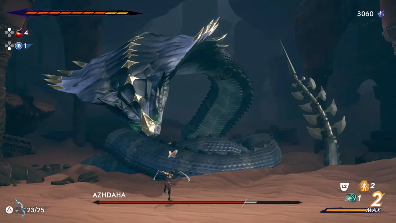
SKILL BOOSTER: Mastering your silhouette
Silhouette is the first language of animation. A pro game animator breaks down line of action, weight, negative space and the workflow behind poses that read instantly.

Animating, exploring, starting over for twenty years
After twenty years in an animation career, Vanessa Rufra reflects on passion, burnout, starting over, and what truly keeps you moving forward in this industry.
Timing & Spacing
Timing and Spacing in Animation: Why Spacing Is So Important
Every animation textbook pairs them together. Spacing and timing....
Meet the Speakers: How to Break Into the Animation Industry

For anybody out there that is trying to break into the animation industry right now, this one is for you. This Thursday, May 21 at 10 A...

AI in Game Animation Won’t Replace Animators – But Ignoring It Will
AI is changing game animation. It won't replace skilled animators, but the ones who ignore these tools are taking an unnecessary career risk. Here's an honest breakdown of what's actually happening.

How to Build a Game Animation Showreel That Actually Gets You Hired
Most game animation showreels fail not because of weak animation, but because they're poorly structured, too long, or unfocused. Here's how to build a reel that hiring managers actually want to watch.

The 7 Best Free Maya Rigs, Picked by Download Numbers
Seven production-quality free Maya rigs from seven different professional creators, creature, gameplay, facial and acting practice, all free to download.
Welcome to Animworks – The Animation Collective You’ve Been Waiting For
If you've ever found yourself down a rabbit hole at 2am trying to find a decent rig, a reliable plugin, or just someone who gets it, we...