








The fundamental skill that runs through every field of animation
Why this skill matters
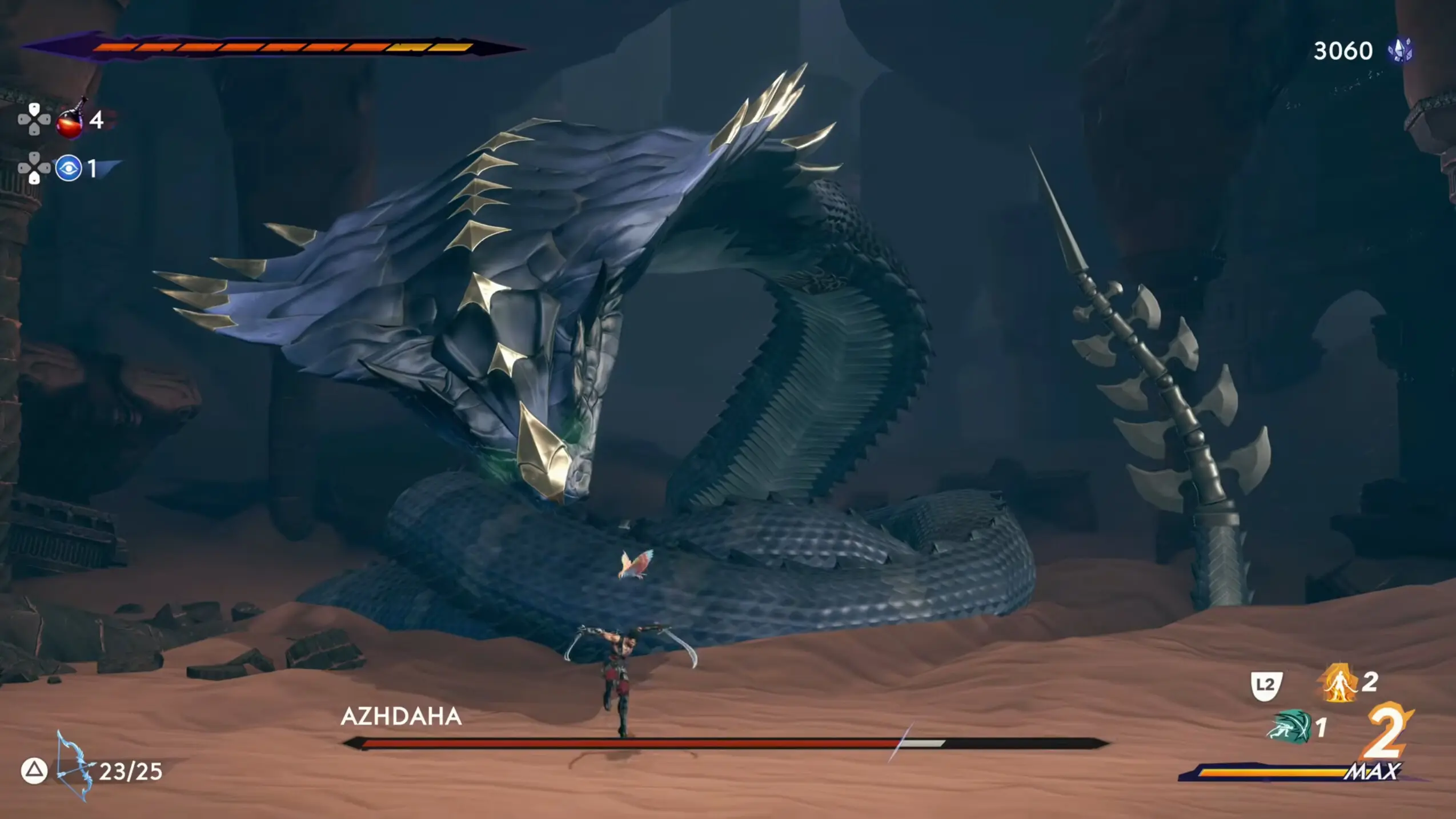
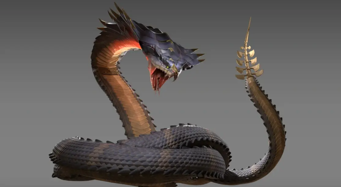
When I was working on Prince of Persia: The Lost Crown, a fast-paced 2D side-scroller with over 80 different enemies, one boss stood out: Azhdaha.
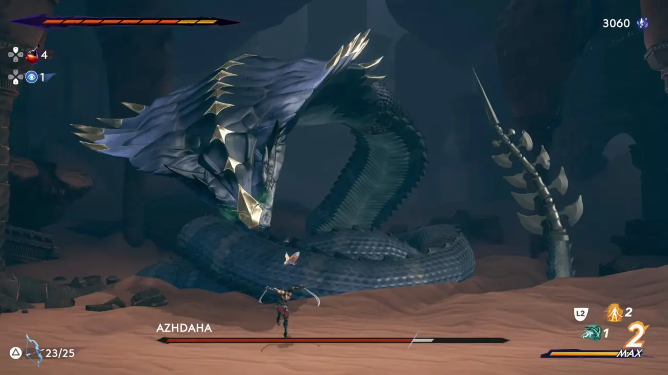
A forty-meter-long serpent. A body coiled on the ground, a long fully-articulated neck, a tail surging from the sand. The neck, the head, and the tail carried the entire silhouette. The camera was placed far from the player. Azhdaha filled the entire screen, and the challenge was clear: make it fit in frame without ever losing the sense that it was gigantic, crushing, completely out of scale with the player character.
In those conditions, the silhouette became the primary tool.
The player had to understand in a fraction of a second what this monster was about to do, before perceiving any details, before reading any articulations.
No time to analyze. No time to decode. Just a shape. A movement. A signal.
That’s what a silhouette is.
It’s not an academic exercise or a box to check on a junior’s production checklist. It’s the first language your animation sends, before timing, before spacing, before style, before the eye even picks up the details of the model or textures.
And it’s a skill that runs through every field of animation.
- In film, it guides emotion and staging.
- In VFX, it lets you read a complex action in the middle of visual chaos.
- In video games, it supports characterization, readability, and player reactivity.
- In 2D as in 3D, it’s the backbone of every pose.
What I’ve observed across every project I’ve worked on, and now with my students: the animators who improve the fastest are the ones who work their poses. Not the ones who master the most techniques, the ones who understand what their silhouette is communicating.
Because a good silhouette is an animation the audience understands without effort.
What a silhouette really is
You hear it all the time: “Put your character in black and see if it reads.”
That helps, sure. But it doesn’t tell the whole story.
A silhouette isn’t just an outline. It’s first and foremost an organization of information, a way of making an intention visible before the eye perceives any details.
It answers three simple questions that have served me across every project:
- What is the character doing? The action must be identifiable immediately, no context, no text, no sound needed.
- Where is the energy going? The direction of the movement, the body’s intention, the dynamic of the action, all of that must read in the overall shape.
- What does the audience need to anticipate? The silhouette sets up what’s coming. It makes a visual promise.
What changes from one context to another is the intention and the constraints.
What never changes is this principle that has always guided me: if I have to explain my pose, it’s not speaking loudly enough on its own.
Technique never compensates for a weak pose.
An important nuance: not every pose needs the same level of readability.
An idle can be subtle, with discreet micro-movements. Readability matters, but it doesn’t need to be explosive.
An attack, on the other hand, MUST be instantly recognizable, here, readability is non-negotiable.
A hit react needs to communicate the direction of the impact in just a few frames.
A walk cycle can afford more nuance, because it stays on screen longer.
This principle applies across every medium.
In film, the length of the shot determines the readability required, a wide, fast shot demands a stronger silhouette than a tight shot that lingers.
In VFX, an action buried in effects needs an over-exaggerated silhouette to survive.
Adapting your level of exaggeration and clarity to the reading context is one of the keys to professional production.
The components of the silhouette
The silhouette works like a set of reference points, focal areas that have helped me make my poses more readable, more intentional, more coherent. Here are the ones that have served me most.
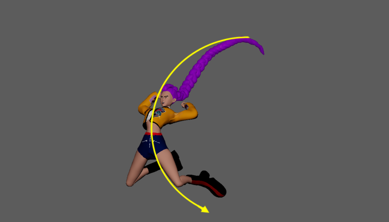
The Line of Action
This is the backbone of the pose. It carries the energy, the dynamic, the emotion, the intention. When the line of action is weak, the pose is soft, unconvincing. When it’s clear, everything else becomes simpler to build.
One rule: one line = one intention. The moment a pose tries to say two things, it says nothing.
When we were reworking Jodie’s idles on Beyond Two Souls from raw mocap, this was always where we started.
The mocap gave us a realistic base, a body that had actually moved, but in production, realism isn’t enough.
My job was to reshape that material: adjust the bust posture, the shoulders, the way the head was carried, the foot spacing, the hands, the fingers, everything that would allow the idle to embody a precise state: rebellious, courageous, frightened, exhausted, depending on the character’s age and moment in the story.
That line of action then became the reference for her entire moveset. If it wasn’t right from the start, everything that followed felt wrong.
Mocap is raw material. The silhouette is what you sculpt from it.
The Layered Workflow: Building the Silhouette in the Right Order
A readable silhouette never comes out in one block. It builds in layers, from the most important to the most refined. And most importantly: never move to the next step until the silhouette reads clearly at distance.
- The trunk first. Hips, center of gravity, torso. This is where the weight, the balance, and the general direction live. If this base isn’t clear, nothing will be.
- The legs next. They immediately recalibrate the balance, the pelvis height, the weight direction, the stability of the pose. They define the character’s anchor in space.
- The arms. They play a huge role in the silhouette, creating lines, arcs, directions, negative space. I build them by looking first for the overall shape, the direction, the read. Not the details yet.
- The head. Small in the silhouette, but decisive. Even without facial expression, the tilt of the head changes everything : confident, wary, aggressive, determined… I place it once the body is already readable.
- The hands, without the fingers first. Hands are signposts. They indicate intention, direction, energy. I block them in simple shapes, just the general orientation and read.
- Details last. Fingers, clothing, accessories, subtle asymmetries. Only once the silhouette works at distance and in black do I go here. These details enrich the pose, but they should never define it.
This workflow works because it respects the natural order of visual reading, and above all, it prevents wasting time on details that won’t survive at ten meters distance.
Weight Distribution
Weight is what gives an animation credibility: a body that anchors, resists, falls, pushes, carries.
You can animate it with coherent poses, body mechanics, timing, but for all of that to work, the silhouette must already be solid.
A readable silhouette clearly shows which limb is bearing the load, which is free, where the balance sits, how the body will evolve.
Even without details, you should be able to feel whether the character is grounded, off-balance, tense, or suspended.
This is true in realistic animation, in stylized, in 2D as in 3D.
And it’s something I notice even in my own poses: sometimes everything is technically “correct,” but the body doesn’t seem to actually weigh anything. Often it just takes a small adjustment, a slightly shifted pelvis, a tilting shoulder, a repositioned foot, for the pose to gain credibility and readability.
If I don’t know where the weight is, I don’t yet know what the pose is saying.
Negative Space
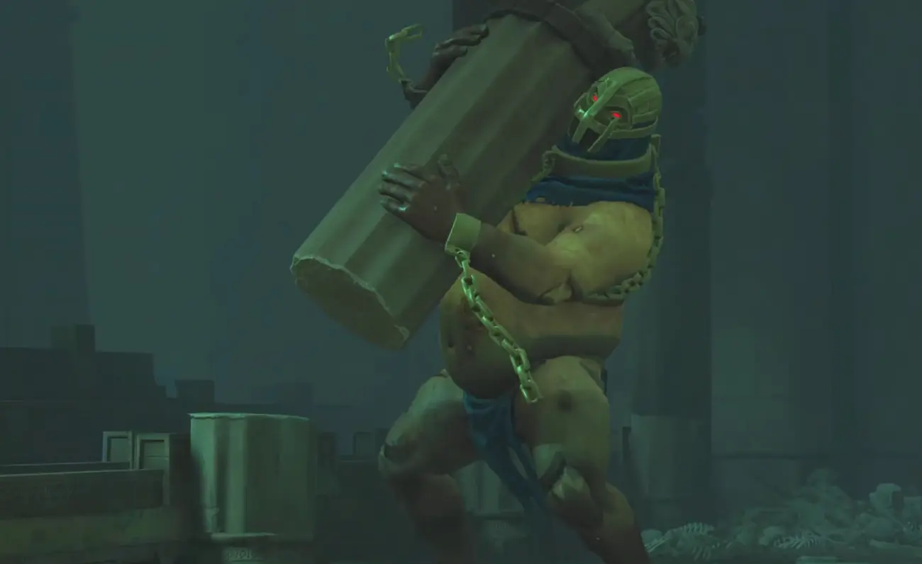
The further I get in my career, the more I see these voids as indispensable breathing room for the eye. They help distinguish shapes, avoid visual collisions, clarify the action.
In 2D, or in film with a fixed camera, this is a huge advantage. When the angle is constrained, you know exactly what you’re showing. You can place negative space with precision, separate the masses, control what the eye reads first. On Prince of Persia, that constraint gave us total control over the silhouette: we knew exactly where to place the arms, the weapons, how to detach the head from the torso, how to create a readable void.
Every enemy had its own silhouette, designed to highlight its personality, its gameplay role, and especially its weapons.
For Azhdaha, negative space was essential: divided into three clearly distinct sections, its body occupied the floor, its neck and head formed a long line, and its tail created visual rhythm across the sand. We sculpted the voids between them so the player could immediately understand where the threat was, where the movement was going, and which part of the serpent was about to strike.
Every negative space became a staging tool: a way to guide the eye, clarify the action, and reinforce the character’s scale.
That was composition.
In 3D video games, it’s different. The camera can rotate around the character, you can’t guarantee a clean silhouette at every angle. You have to make choices, decide which information must remain readable as a priority, and accept that some will be less visible depending on the spectator’s position.
It’s not harder. It’s a different way of thinking about readability.
Information Hierarchy
Not everything carries the same weight in a pose.
Experienced animators consciously build a hierarchy: intention first, movement second, details last.
On Assassin’s Creed Unity: Dead Kings, this hierarchy was essential. We had a scene in a crypt plunged in darkness. The assassin was moving through it, lantern in hand. The challenge: keep the scene readable despite the low lighting, the hood covering the face, and a dark environment that threatened to swallow the character whole.
The lantern had to be the first thing read, it was the element that guided the eye, gave the direction, set the intention of the scene. It had to stand away from the arm, clearly separated from the body, to create a readable negative space. The face came second. Even under the hood, we needed to understand where the assassin was looking. The lighters adjusted the lighting to prevent the hood from plunging the face into total shadow. Details came last, once intention and read were established.
That kind of situation taught me that silhouette isn’t just an animation matter. It’s a collective construction. Lighters, camera operators, art directors, animators …everyone participates in the information hierarchy.
Weapons and Objects
A pose without a weapon and a pose with one are two completely different readability challenges.
The weapon changes everything: the read, the direction, the balance, the silhouette.
Three rules I use systematically.
- The weapon must always be separated from the body.
If a sword, staff, or gun merges with the torso in the silhouette, the audience can no longer understand anything, not where it is, not where it’s going. Push the weapon away from the body, even if it means slightly distorting the anatomy. In fast movement, no one will see the distortion. But everyone will see the confusion if the weapon disappears.
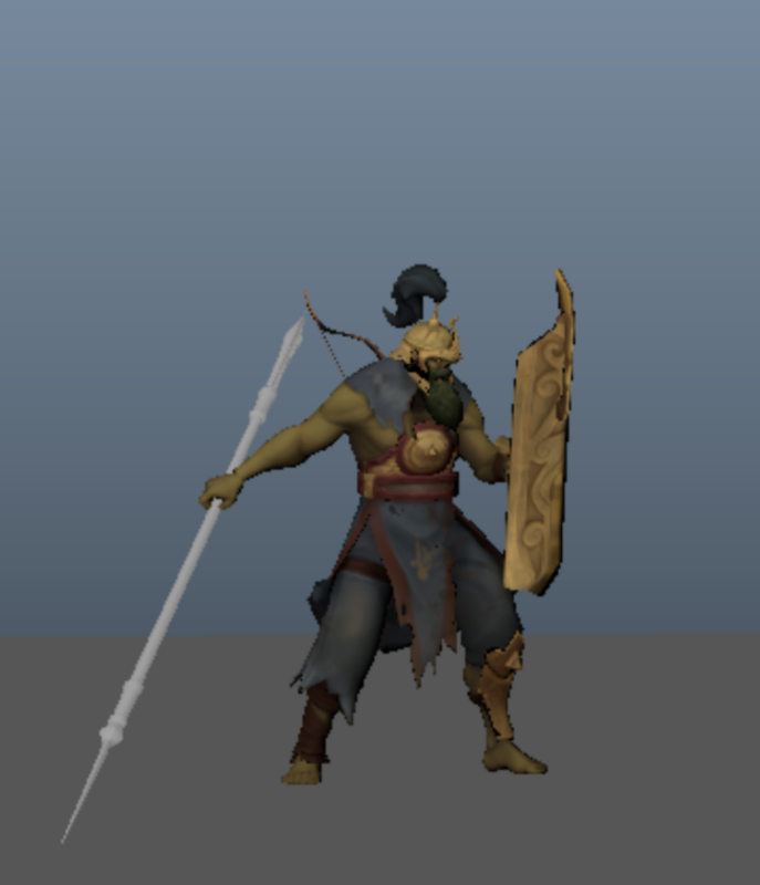
- The body adapts to the weapon, not the other way around.
The classic mistake: pose the body “correctly,” then place the weapon and discover it ruins the silhouette. Establish the weapon’s intention first, its direction, its read, its place in the silhouette, then build the body around it to maximize readability.
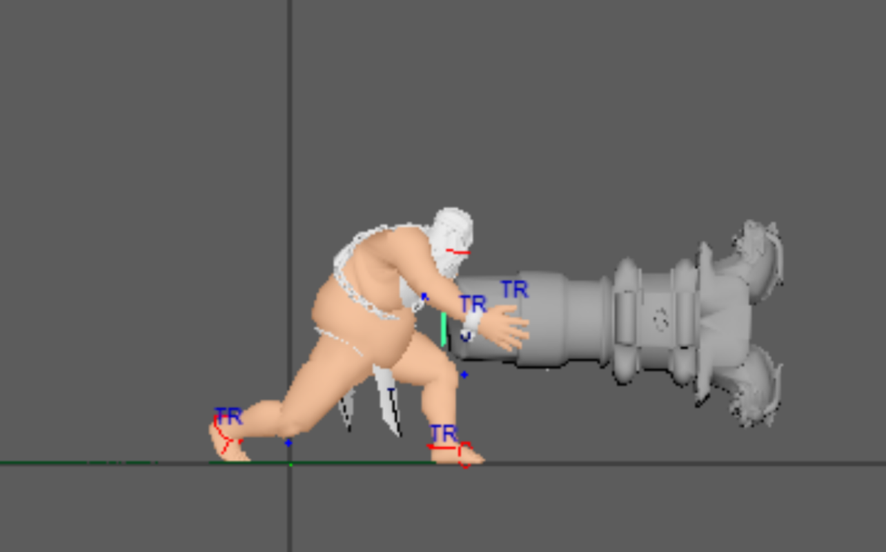
- The weapon defines the direction.
In an attack, the weapon often carries the most readable line of action. The body follows, but the weapon leads. Mask the body, keep just the weapon. Is the direction of the action obvious? If yes, you’re good.
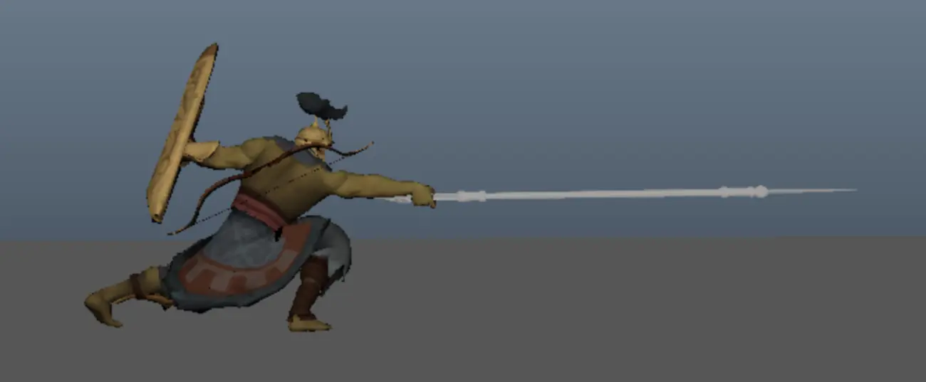
This principle applies in film and VFX too , a held object, a weapon, an important accessory often becomes the primary element of the silhouette. It’s the first thing you place.
Primary Shapes
Circle, square, triangle. These three shapes encode immediate emotional information : softness, stability, danger.
Character designers use them consciously. Animators do too, often without realizing it.
In a silhouette, they influence how the character is perceived before movement even begins.
- A massive, stable character naturally leans on square shapes: wide shoulders, solid pelvis, horizontal footing. The silhouette breathes strength and groundedness.
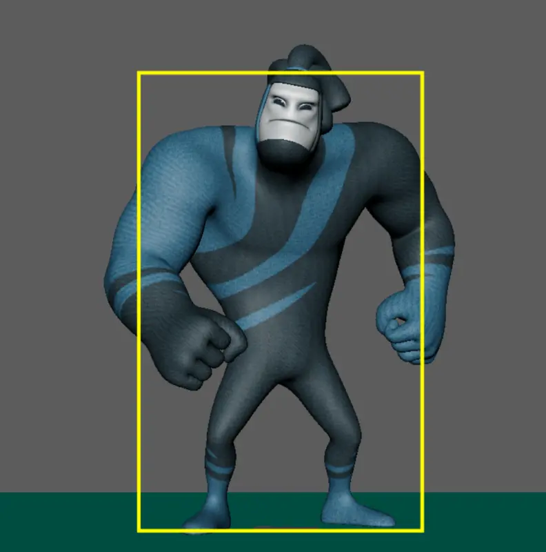
- A fast or dangerous character leans on triangles and diagonals: lines that point, cut, direct. The silhouette becomes more aggressive, tense, unpredictable.
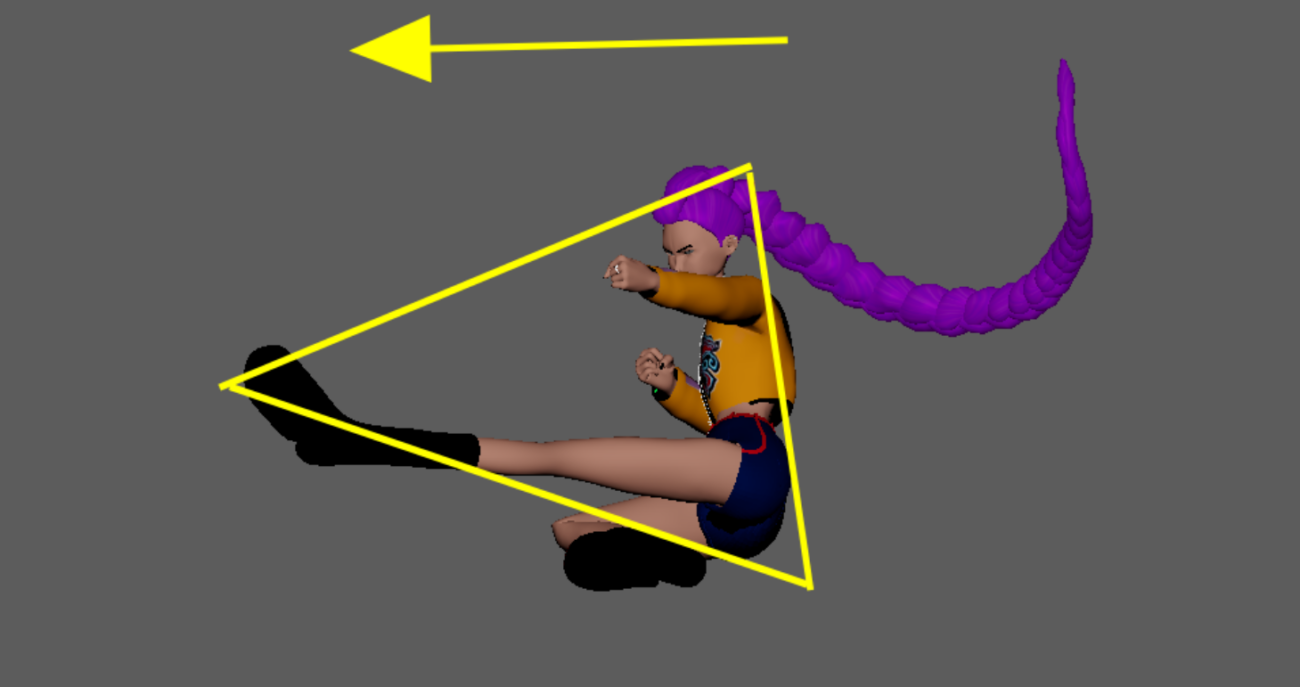
- Circles soften, round out, soothe. You find them in friendly silhouettes, protective poses, or poses meant to inspire trust, but also in agile movements, where the body coils, wraps, and creates arcs of flexibility.
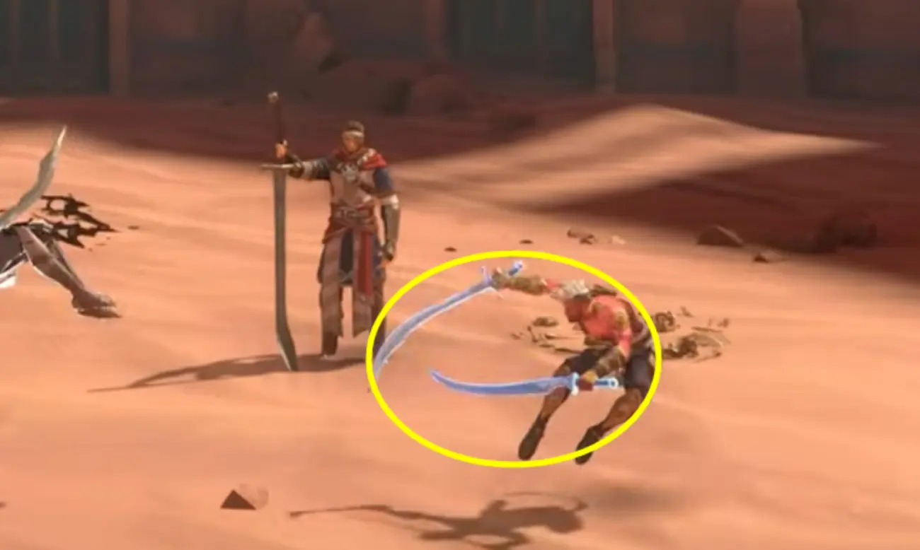
This visual language operates in the background. The audience isn’t conscious of it, but they feel it.
And in animation, playing with these shapes, reinforcing them, breaking them, subverting them, allows you to clarify an intention, amplify an emotion, or set up a movement.
The silhouette carries this language, even when no one sees it.
How pros think
Over time, the questions about poses evolve.
A junior asks: “Is the pose pretty?”
A more experienced animator asks: “Does the pose clearly communicate the character’s intention?”
It’s a natural evolution. You start by looking for beauty, then you discover that beauty in animation comes from clarity. A pose that clearly tells its story is often more convincing than a highly refined pose that says nothing in particular.
They clarify before they polish
I see it regularly with my students. When we work on combat, many want to immediately jump into epic animations, big movements, dynamic camera, impact.
That’s normal, we’ve all been there. But their poses aren’t yet solid enough to carry that ambition. The silhouette doesn’t show the intention, the energy isn’t flowing. The result is often soft, too fast, unreadable, the opposite of what they had in mind.
Working on a neutral grey background with perfect lighting is an illusion. In production, your silhouette will have to survive real predators: camera distance, visual chaos, dark lighting, ultra-fast cutting.
So we go back to something simple: a blocking pass with four key poses that tell the action. Four. No more. And those four poses must read in black silhouette, at distance, without context. If the action isn’t understandable under those conditions, it won’t be in the final animation either.
They think in systems, not isolated poses.
Once the pose is clear, they widen their perspective.
In film, a pose exists within a shot, within an edit.
In video games, it exists within a set of blending animations, a shifting camera angle, a real-time read.
The pose is no longer alone, it depends on what comes before and after.
On Ghost Recon, the military equipment took up a lot of screen space, the camera was very close to the character, and cover poses and weapon-ready stances had to stay readable in that context.
You couldn’t think about the silhouette in isolation, you had to think about it alongside the camera, the gameplay, the way animations connected to each other.
They think in critical frames.
In production, you don’t check every frame in silhouette.
You focus on the key poses, the ones that carry the read of the movement.
For an attack: the extreme anticipation, the point of no return, the impact, the follow-through. Those four moments MUST be perfect in silhouette. The transitions between them can be looser, the movement will guide the eye.
That contrast between held poses and fast transitions is what allows the audience to read the action. This principle applies in gameplay, film, and VFX alike.
They adapt their level of exaggeration to the context.
Even in a realistic style, you need to exaggerate.
The Last of Us, Ghost of Tsushima, God of War, all of these “realistic” games use exaggerated poses because camera distance and action speed crush subtleties.
What reads as realistic in close-up becomes invisible at ten meters. The same logic applies in film: a wide shot demands a stronger silhouette than a tight shot.
How to Observe the Silhouette
Start with the most direct test: go full black.
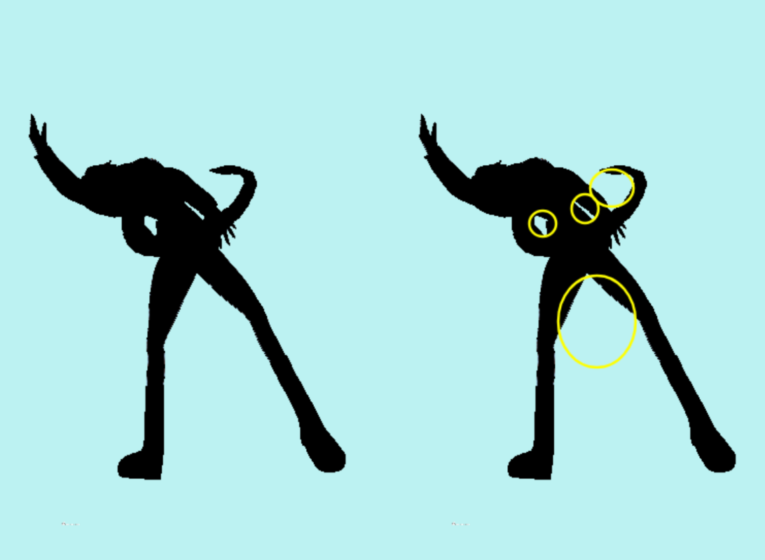
A pure silhouette immediately reveals the confused zones, overlapping limbs, insufficient negative space, absent line of action, too-closed shape.
In any 3D software, the principle is the same: cut the lights, switch to black, look at what’s left.
If you don’t have 3D at hand, sketching the silhouette in five minutes forces you to think in simple shapes and validates readability before investing time.
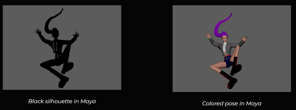
Test at a distance, step back enough to simulate a real‑world read.
If the pose starts to get confusing, push the exaggeration.
Exaggeration in animation isn’t a flaw, it’s what survives distance, editing, and visual effects.
On Prince of Persia, every attack had to read in under a second with the camera placed quite far from the characters. No room for ambiguity.
Send the silhouette without context.
Take a screenshot of the black silhouette and send it to someone without any explanation.
One question only: “What is this character doing?” If the answer comes immediately, you’re good. If the person hesitates or guesses something else, the silhouette needs more work.
This test isn’t new. But animators who use it systematically improve much faster than those who rely solely on their lit viewport.
Study the best.
Not to copy, to understand.
Spider-Man: extreme clarity at high speed.
God of War: power and intention in every pose.
Arcane: expressivity and narrative through shape.
Into the Spider-Verse: graphic rhythm and design.
Sekiro: danger communicated instantly.
These works look nothing alike, but they share the same obsession: readability.
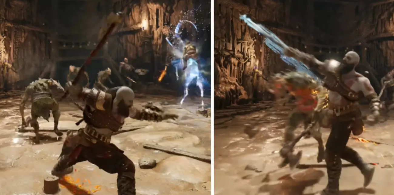
Test in motion.
We’re talking about animation. A silhouette doesn’t live in a static pose. It must remain readable in motion, in rotation, under acceleration, in editing, under visual effects. What works in your clean software viewport can fall apart in production. Always test in the real context.
Try It Yourself
Here are a few exercises to help strengthen the readability of your poses.
Exercise 1 – Quick Read: The 4 Key Poses Test
Choose a simple action: an attack, a fall, a reaction.
Create exactly four key poses that tell this action from start to finish. No more.
For each one: black silhouette, distance test, quick read. The goal isn’t for them to be beautiful, it’s for them to tell the story without needing explanation.
Common trap: trying to show everything in one pose : anticipation, action, and recovery all at once.
Choose the most iconic moment for each step. If you have to comment on a pose for someone to understand it, it’s not clear yet.

Exercise 2 – Push the Exaggeration: The Distance Challenge
Place your character at three different distances: close-up, medium shot, wide shot.
The silhouette must survive all three. If it falls apart in the wide shot, the intention isn’t strong enough. Push the exaggeration 20% further and retest.
Common trap: a pose that works perfectly in close-up but becomes unreadable the moment you step back.
Distance is merciless, it reveals everything the lit viewport was hiding.
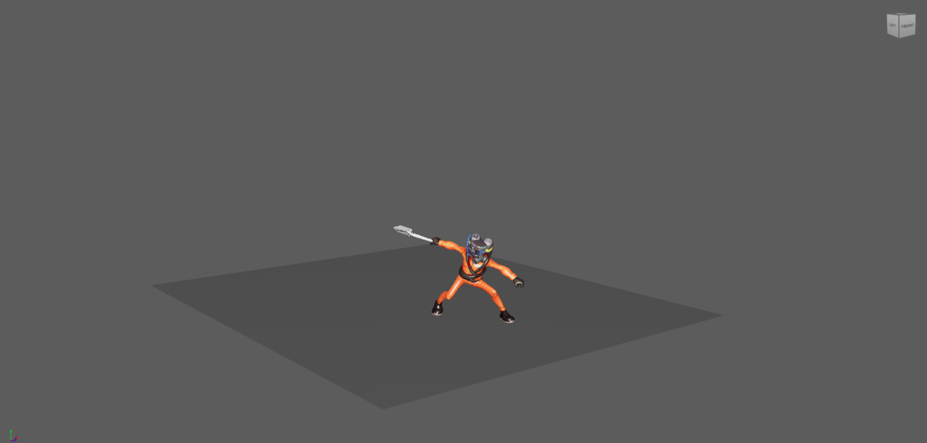
Exercise 3 – The Emotional Silhouette: Tell It with the Body
Create four poses: fear, anger, glory, fatigue.
No facial expression. Just the body, just the pose. Pass each one in black. If the emotion remains readable in pure silhouette, the language is working. If it disappears, the pose is relying too much on the face, whereas the body needs to speak first.
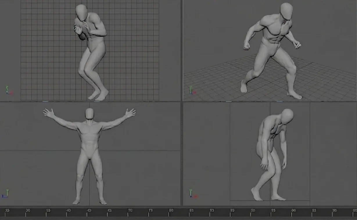
Common trap: poses that are too symmetrical.
Asymmetry is almost always more readable and more natural. A body that hesitates cannot be perfectly centered.
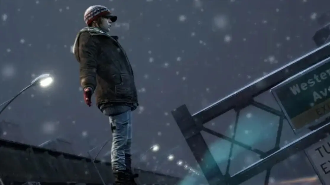
Exercise 4 – The Stress Test: Real Environment
Test your silhouette in a busy environment, dark lighting, a complex background.
These are the conditions the silhouette must hold up in. Think of the Assassin’s Creed crypt scene, if readability depends on perfect lighting, the silhouette isn’t solid enough.
Common trap: validating a pose in a clean, empty viewport.
In production, the character will never be alone on a neutral background. Always test in real conditions.
Exercise 5 – Hunting Twinning: Strengthen the Asymmetry
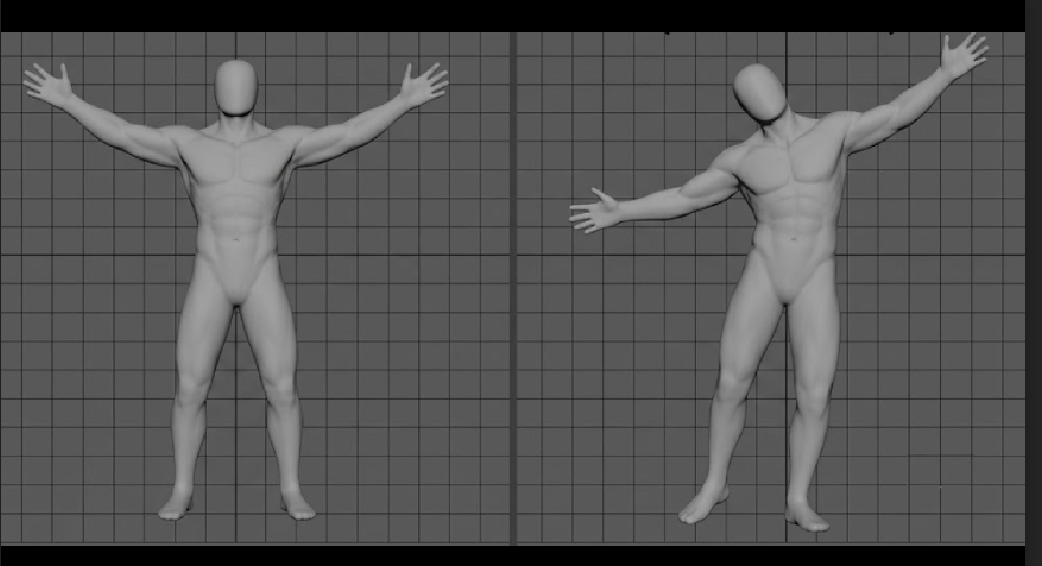
Twinning is animating both sides of the body symmetrically ; both feet aligned, arms open at the same angle.
It’s the fastest way to make a pose feel robotic. Take an existing animation, go through your key poses, and systematically break the symmetry: shift a hip, bring a foot forward, tilt the shoulders. Your silhouette will instantly gain life.
Common trap: confusing symmetry with balance.
A pose can be perfectly balanced and totally asymmetrical. Asymmetry doesn’t break stability, it makes it feel alive.
These exercises work in film, VFX, series, video games, 2D and 3D alike, anywhere a pose needs to be understood before it’s refined.
Quick Troubleshooting
Here are a few rapid diagnostics I use when a silhouette isn’t working as expected.
- My silhouette reads from the front but not from the side. The masses are overlapping in depth.
Push arms and legs out in Z to create depth and avoid overlaps, create diagonals. Check from the top view, nothing should be perfectly aligned.
- The anatomy is correct, but the pose is still unreadable. Readability comes before anatomy.
If an anatomically “accurate” pose doesn’t communicate anything, it isn’t serving the animation. Strengthen the diagonals, open up the masses, simplify the read. The audience doesn’t notice perfect anatomy, they instantly feel unclear intention.
- Silhouette reads in static but falls apart in motion. The transitions are too long.
Identify your three or four key poses, speed up the transitions between them, and hold the important poses longer. Rhythmic contrast guides the eye.
- The weapon is ruining the silhouette. Change the weapon’s angle, or build the body around the weapon rather than the other way around. The weapon takes priority in the silhouette, it carries the direction.
- The pose is technically correct but feels “soft.” There’s not enough tension. Reinforce the compression or extension, accentuate the diagonals, add strong asymmetry. A neutral pose communicates nothing.
Key Takeaways
The silhouette is the first language of animation.
Before timing, before style, before details, it’s what tells the story of intention, weight, emotion, and what comes next.
It’s not there to be pretty. It’s there to be understood. A clear silhouette speaks for itself, without explanation.
Not every pose needs the same level of readability. Adapt your exaggeration to the reading context, shot length, camera distance, action speed.
Build your silhouette in layers, in the right order: trunk, legs, arms, head, hands, details. Don’t move to the next step until the silhouette reads clearly at distance.
Mocap, drawing, blocking, all of that is just raw material. What you’re really sculpting is the line of action, the negative space, the hierarchy of masses.
In 2D or in film, the constrained angle is an advantage, you control exactly what you show. In 3D video games, the silhouette must work at every angle. Two different constraints, one same principle: readability.
The silhouette never lives alone. It exists with the light, with the camera, with the edit, with the artistic choices. It’s a collaborative effort.
And beyond all the techniques, all the workflows, all the constraints…
if there’s one thing to keep: if you have to explain your pose, it’s not readable yet. The silhouette must speak for itself.
Related posts
Artist Highlight: Laura Lico (Moss : Book II)
/* Hallmark · component: in-post callout (after ruixen banner-newsletter, rebuilt plain CSS) · genre: editorial · theme: Animwo...
What You Can Learn From… Woody ! Reading Silhouette Like a Pro
Five poses from Toy Story, broken down shot by shot, and how to rebuild each one on the free Woody rig for Maya.
Art of the Hold
Keeping Stillness AliveThere's a moment in animation that trips up a lot of people, and it's not a complex breakdance or a tricky overl...
Animating, exploring, starting over for twenty years
After twenty years in an animation career, Vanessa Rufra reflects on passion, burnout, starting over, and what truly keeps you moving forward in this industry.
Timing & Spacing
Timing and Spacing in Animation: Why Spacing Is So Important
Every animation textbook pairs them together. Spacing and timing....
Procedural Animation
There's a moment every game animator knows. You've just finished a beautiful walk cycle. The foot plants are perfect, the weight reads ...

1st-Person vs 3rd-Person Animation
When people starting out in game animation ask which style they should focus on first, most seem to assume it doesn't really matter. An...
The 12 Principles of Animation, Reframed for Games
Frank Thomas and Ollie Johnston, circa 1995.Image courtesy IMDB.
Almost every animator who comes up through formal training gets the ...
Meet the Speakers: How to Break Into the Animation Industry

For anybody out there that is trying to break into the animation industry right now, this one is for you. This Thursday, May 21 at 10 A...

AI in Game Animation Won’t Replace Animators – But Ignoring It Will
AI is changing game animation. It won't replace skilled animators, but the ones who ignore these tools are taking an unnecessary career risk. Here's an honest breakdown of what's actually happening.

How to Build a Game Animation Showreel That Actually Gets You Hired
Most game animation showreels fail not because of weak animation, but because they're poorly structured, too long, or unfocused. Here's how to build a reel that hiring managers actually want to watch.

How to Future-Proof Your Game Animation Career: The Skills Studios Are Hiring For in 2026
The games industry is shifting fast. Here are the skills that studios are actually hiring for in 2026, and how game animators can build a career that stays relevant through the change.